Colors Reference Hub: Undertones, Tonal Families & Hardware Pairing
Craie reads warm in tungsten, cool in daylight. Bleu Nuit deepens to near-black in shadow. Getting Hermes color right means understanding how each colorway behaves — not just what it looks like in a photograph.
Understanding Hermes Color
Color is the most expressive and most misunderstood variable in the Hermes universe. Craie reads warm in tungsten light and cool in daylight. Gris Tourterelle sits between grey and taupe in a tonal family that photographs differently depending on leather grain. Bleu Nuit deepens to near-black in shadow and reveals its sapphire undertone in direct sun. Getting color right requires understanding how each colorway behaves across light conditions, leather textures, and hardware finishes.
This is the central color reference hub for hermesguidancelounge.com — covering seasonal colorways, tonal family groupings, color-to-hardware pairing logic, and side-by-side comparisons of the most frequently confused neutral and cool-toned shades. For leather-specific color behavior, see the Leathers & Materials Guide. For hardware pairing in depth, see the Hardware & Craftsmanship Guide.
Understanding Hermes color requires moving past the product photograph. A bag photographed in studio lighting reads differently on a boutique shelf, differently again outdoors in natural light, and differently once more under warm tungsten at a restaurant or hotel. The colorway is not a single fixed point — it is a range of readings, and understanding that range is the difference between a color that surprises you and one that consistently suits you.
Tonal Families Explained
Hermes colorways cluster into tonal families defined by their shared undertone direction. Understanding which family a color belongs to is the most practical tool for building a coherent collection and selecting a color that works across your existing wardrobe.
- Warm Neutrals: Trench, Macadamia, Nata, Gold, Caramel, Etoupe. Share a warm yellow-beige undertone that reads naturally with earth-tone wardrobes and GHW. Most wearable neutrals for warm skin tones.
- Cool Neutrals: Craie, Gris Tourterelle, Gris Asphalte, Blanc. Cool-leaning undertones that pair naturally with PHW and contemporary monochromatic styling. Most versatile for cool-toned wardrobes.
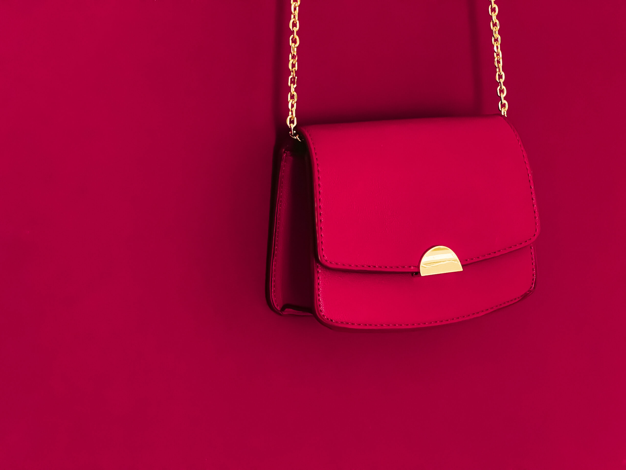
- Deep Shades: Noir, Bleu Nuit, Rouge H, Bordeaux. High-saturation, high-depth colorways. Suit both PHW and GHW depending on warmth desired. See which deep shades command the highest resale premium.
- Blues: Bleu Nuit, Bleu Saphir, Blue Jean, Bleu Electrique, Bleu Agate. Range from casual mid-tones (Blue Jean) to deep jewel shades (Bleu Nuit). PHW is the standard pairing across this family.
- Greens: Vert Amande, Vert Cypress, Vert Criquet, Vert Bosphore. From pale sage (Vert Amande) to deep forest (Vert Cypress). GHW suits deeper shades; PHW suits paler tones.
When building a multi-bag collection, staying within adjacent tonal families creates visual coherence. A warm neutral Birkin, a deep shade Kelly, and a green Constance can coexist — they share enough tonal logic to feel considered rather than random.
Neutral Color Comparisons
The most common color confusion in the Hermes universe occurs within the neutral family. Craie vs Nata. Gris Tourterelle vs Gris Asphalte. Trench vs Macadamia. These pairs are frequently confused in resale listings, boutique conversations, and collector discussions. The differences are significant — both visually and in terms of hardware and wardrobe compatibility.
Reads warm under tungsten, cool in daylight. Chalky off-white. Best with PHW. Shifts more across light conditions than any other neutral. Full comparison: Craie vs Nata with Rose Gold.
Consistently warm across all light conditions. Yellow-ivory depth that reads more definitively cream than Craie. Suits GHW and RGH. Full comparison: Craie vs Nata with Rose Gold.
Sits between grey and taupe. Reads softer on Togo, crisper on Epsom. Full comparison: Gris Tourterelle vs Gris Asphalte.
Deeper, cooler, more definitively grey than Tourterelle. Reads almost charcoal on Epsom. Strong PHW pairing. Full comparison: Gris Tourterelle vs Gris Asphalte.
Warm mid-toned caramel-tan. More golden and saturated than Macadamia. Pairs instinctively with GHW. Full comparison: Trench vs Macadamia.
Lighter and less saturated than Trench. Reads as pale biscuit in natural light. Versatile GHW or PHW pairing. Full comparison: Trench vs Macadamia.
Blues & Greens
The Hermes blue and green families offer the widest range of saturation depth of any color group in the permanent palette — from the pale, almost-neutral Vert Amande to the near-black depth of Bleu Nuit.
Deepens to near-black in shadow. Sapphire undertone reveals in direct sunlight. PHW standard pairing; GHW adds warm evening contrast. Full comparison: Bleu Nuit vs Bleu Saphir.
Lighter and more expressly blue than Nuit at all times — no near-black shift. Reads consistently royal blue. PHW pairing. Full comparison: Bleu Nuit vs Bleu Saphir.
Pale cool sage — almost neutral in certain light. PHW is the natural hardware pairing. Full comparison: Vert Amande vs Vert Cypress.
Rich deep forest green. Reads with full saturation across all light conditions. GHW adds warmth; PHW keeps it contemporary. Full comparison: Vert Amande vs Vert Cypress.
Color-to-Hardware Pairing Logic
Hardware finish is the resolution of a color decision — not an afterthought. The same colorway reads entirely differently with PHW vs GHW. For the complete hardware guide, see the Hardware & Craftsmanship Guide.
- PHW (Palladium): Universal compatibility. Strongest with cool neutrals (Craie, Gris Tourterelle), all blues, pale greens, and Noir. The safest first-bag hardware choice across all color families.
- GHW (Gold): All warm neutrals (Etoupe, Trench, Macadamia, Nata), deep jewel tones (Bleu Nuit, Bordeaux, Rouge H), and deep greens (Vert Cypress). Adds warmth suited to classic and traditional styling.
- RGH (Rose Gold): Pale warm neutrals only — Craie, Nata, Rose Sakura, Mauve Pale. Avoid with deep or saturated colorways and generally not recommended with blues or greens. See Craie vs Nata with Rose Gold.
- Permabrass: Naturalistic earthy colorways — Sesame, Etoupe, Gold, Barenia-toned leathers. The antique warmth suits tactile warm-toned combinations. Less suited to cool or pale colorways.
Seasonal Color Strategy
Hermes releases new colorways twice yearly — Autumn/Winter and Spring/Summer. Understanding the difference between permanent palette colors and seasonal releases is essential for considered acquisition decisions. For a full 2026 forecast, see Hermes Seasonal Color Release Predictions for 2026.
Permanent palette colors — Noir, Etoupe, Craie, Bleu Nuit, Rouge H — are available year-round and hold the strongest resale consistency. Seasonal colors appear for one or two seasons then retire. The most collectible are discontinued after a single season. For resale implications, see Best Hermes Neutral Colors for Long-Term Value in 2026 and Which Hermes Colors Command the Highest Resale Premium.
Color Reference Table
Key Hermes Colorways — Tonal Family, Undertone, Palette Status & Best Hardware
| Colorway | Tonal Family | Undertone | Palette Status | Best Hardware |
|---|---|---|---|---|
| Noir | Deep Shade | Neutral black | Permanent | PHW, GHW |
| Craie | Cool Neutral | Cool off-white, light-shifting | Permanent | PHW, RGH |
| Nata | Warm Neutral | Warm ivory-cream | Permanent | GHW, RGH |
| Etoupe | Warm Neutral | Warm greige | Permanent | PHW, GHW |
| Gris Tourterelle | Cool Neutral | Warm-neutral greige | Permanent | PHW |
| Gris Asphalte | Cool Neutral | Cool medium-dark grey | Seasonal/returning | PHW |
| Trench | Warm Neutral | Warm golden tan | Seasonal | GHW |
| Macadamia | Warm Neutral | Pale warm beige | Seasonal | GHW, PHW |
| Bleu Nuit | Blue | Deep sapphire, near-black | Permanent | PHW, GHW |
| Bleu Saphir | Blue | Mid-deep royal blue | Seasonal/returning | PHW |
| Vert Amande | Green | Pale cool sage | Seasonal | PHW |
| Vert Cypress | Green | Deep forest green | Seasonal | GHW, PHW |
The most important shift in Hermes color intelligence is moving from treating color as a fixed label — “I want Craie” — to understanding it as a behavior: how it reads in different light, how it interacts with leather grain, and how it resolves against hardware. Craie is not simply a white bag. It is a bag whose color shifts meaningfully across environments.
Choose color based on how it behaves in the contexts where you will actually use the bag — not based on how it looks in studio photography. Visit the individual comparison articles in this series for the most detailed side-by-side color behavior analysis on hermesguidancelounge.com.
Bottom Line: Understand the tonal family first. Understand the undertone direction second. Then select the hardware that resolves both. Color without that framework is guesswork.
The most searched Hermes color comparisons and pairing questions on this hub
🔥 Most Searched
Craie vs Nata with Rose Gold Hardware
How Craie's cool-shifting undertone and Nata's warm ivory read differently with RGH — and which creates the more cohesive tonal pairing.
★ Collector Favourite
Gris Tourterelle vs Gris Asphalte
The most nuanced grey comparison in the Hermes palette — how leather grain changes each colorway's reading and which suits which lifestyle.
⬆ Trending
Bleu Nuit vs Bleu Saphir in Natural Light
How Bleu Nuit's near-black shift in shadow compares to Bleu Saphir's consistent royal blue — and why this matters for everyday wear.
◆ Design Deep-Dive
Vert Amande vs Vert Cypress
Pale sage vs deep forest — how opposite ends of the green family interact with hardware and how each reads on Togo vs Epsom.
⬆ Rising
Best Hermes Neutrals for Long-Term Value
Which permanent palette neutrals offer the widest wardrobe versatility and the strongest resale consistency in 2026.
🔥 Most Searched
2026 Seasonal Color Predictions
How to read Hermes colorway naming patterns and predict which seasonal releases are worth acquiring before they retire.
Frequently Asked Questions
Craie is a cool-leaning off-white with a chalky slightly blue undertone that shifts warmer under tungsten light. Nata is a warm cream with a definitive yellow-ivory undertone that reads consistently warm across all light conditions. Side by side, Craie reads cooler and more contemporary; Nata reads warmer and more classic. For the full comparison with rose gold hardware analysis, see Craie vs Nata with Rose Gold Hardware.
Gris Tourterelle sits between grey and taupe — its undertone is warm-neutral, pulling slightly towards greige in warm light and more definitively grey in cool or natural daylight. On Togo its grain diffuses the undertone, making it read more neutral. On Epsom its tight surface intensifies the grey reading. For a full side-by-side, see Gris Tourterelle vs Gris Asphalte.
Noir, Etoupe, and Craie consistently command strong resale premiums because they are permanent palette colours with broad wardrobe compatibility. Gris Tourterelle also holds well. Seasonal neutrals like Trench and Macadamia can appreciate when discontinued but are less predictable. For the full analysis, see Best Hermes Neutral Colors for Long-Term Value in 2026.
Palladium (PHW) is the most versatile pairing with Bleu Nuit — its cool silver finish complements the blue's depth without competing. Gold hardware (GHW) creates a classic richer contrast that reads evening-appropriate. Rose gold (RGH) is generally not recommended with Bleu Nuit as the warm-pink finish conflicts with the deep cool blue. See the Hardware & Craftsmanship Guide for full pairing logic.
Hermes typically releases new colorways twice yearly — Autumn/Winter and Spring/Summer. Colors that appear in multiple consecutive seasons typically indicate a move toward the permanent palette. Limited one-season releases are the rarest and often most collectible. For a full 2026 forecast, see Hermes Seasonal Color Release Predictions for 2026.